
Auréus is one of the Netherlands’ largest independent wealth managers. Their clients look to them for clarity and stability in complex markets. Every part of their brand has to reflect that same standard.
Our role was to close a gap. Auréus had a strong brand identity, but their whitepapers and print assets told a less consistent story. We built a system of templates and print standards that gave their team independence, reduced design risks, and kept every output aligned with the brand.
The challenge was not about creating something new. It was about making what existed work better.
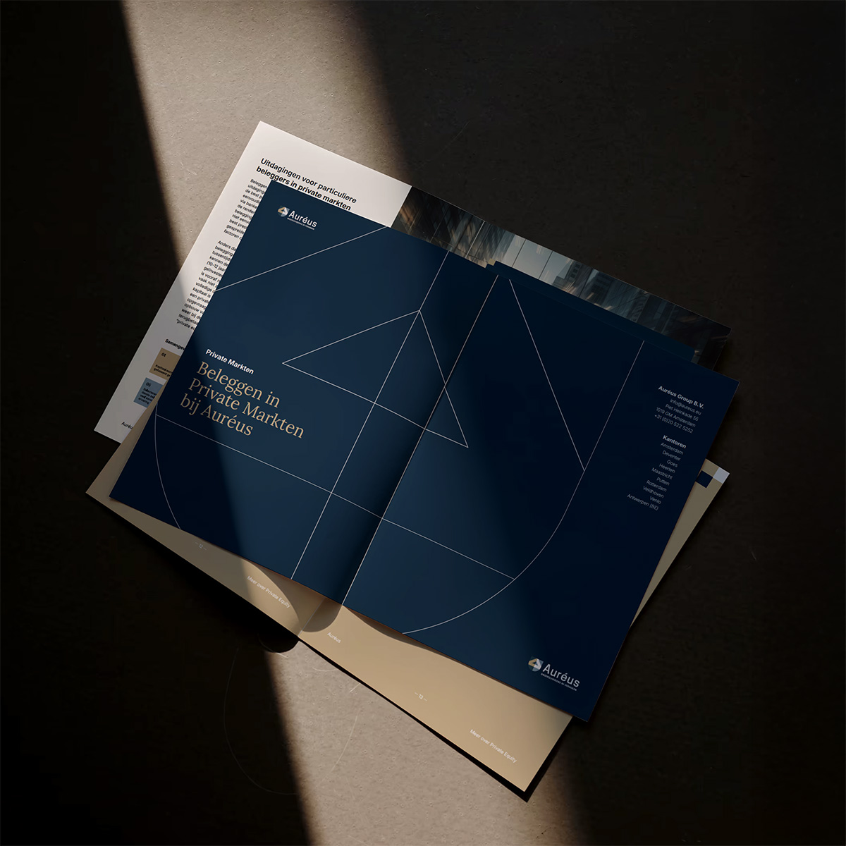
Whitepapers were produced on a case-by-case basis, without a clear format. The result was uneven design and extra time spent managing layouts. At the same time, colours shifted in print, with no CMYK system to guide production.
Auréus needed a system that could scale. One that gave their team confidence to produce high-value documents in-house, while knowing every output would look consistent across formats.
The project was focused on making the existing brand work harder. Auréus needed tools their team could use with confidence — without compromising on quality or consistency. The work centred on design systems, training, and print alignment.
.jpg)
We built the work around clarity and adoption. This was not about reinvention, but about creating usable systems that made the existing brand stronger.
We treated the engagement as a discovery process. Instead of abstract positioning work, we focused on the practical: how Auréus could manage design assets.
Through structured workshops, we introduced design principles, taught the fundamentals of InDesign, and tested templates with the team. Each session was hands-on. Auréus could see how the system worked, ask questions, and shape the outcome.
We created brand assets that translated the brand into everyday use.
For digital assets, we designed scalable templates for whitepapers, reports, and charts. Each followed a clear hierarchy and grid system, making them both professional and easy to update.
For stationery assets, we defined a CMYK print system for coated and uncoated stock. This gave Auréus full control over how their colours appeared in print. It removed the uncertainty from production and ensured that every document looked consistent — whether on screen or on paper.


To extend the value of the training, we introduced AI consultancy. As part of our AI prompt systems service, we built a custom GPT trained on the templates and processes we developed.
This system gave the Auréus team a way to ask questions, get instant answers, and continue using InDesign effectively after the project ended. It made the knowledge from our Workshops sustainable and practical.
The work gave Auréus a system they could trust — across formats, teams, and tools. Design consistency improved, production became more efficient, and internal teams gained the confidence to deliver high-value outputs independently.
