
Creative Comet is a content production partner built to work inside client teams. They deliver video, motion, and design through a subscription-based model they call Content as a Service (CaaS). Acting as a plug-in creative department rather than a distant agency, they simplify how brands scale content. Over the years, their client base expanded and their role matured. Clients began to see them not just as a vendor, but as an extension of their own structure. To reflect this shift, Creative Comet needed a brand identity that matched who they had become.
Creative Comet’s promise was clear: simplify content creation by removing the burden of managing multiple freelancers or agencies. They brought speed, consistency, and creative quality without overhead.
But their identity no longer matched their impact. The old branding was rigid and restrictive. Visual elements had been developed separately, making application slow and inconsistent. The original comet-inspired logo symbolized speed but did not reflect integration, versatility, or the broader creative partnership their clients valued most.
The challenge was to create a brand system that expressed their true role: flexible, embedded, and professional.
The brand needed to reflect what the business had already become. Our goal was to shift perception from “production vendor” to “plug-in content team” — and make that positioning usable across channels, tools, and conversations.
.jpg)
We began with discovery. alignment meetings helped surface how Creative Comet saw themselves and how their clients described them.
With a shared foundation, we moved into positioning and built the framework. This included defining their mission & vision, setting clear brand values, and developing a brand strategy that connected purpose, positioning, and proof into one system. A communication strategy translated these foundations into a usable voice and tone — ensuring Creative Comet could speak with consistency and confidence across every channel.
With strategy in place, we turned to execution.
The goal: a unified brand style. The typeface Outfit was chosen for clarity and scalability, keeping execution simple while balancing professionalism with a creative edge. A refined neutral color palette framed content without competing with it, ensuring the spotlight stayed on client work.
To make the identity practical, we created comprehensive brand guidelines. Unlike the old rulebook, this system was designed as a toolkit — covering logo usage, typography hierarchy, color ratios, and application examples.


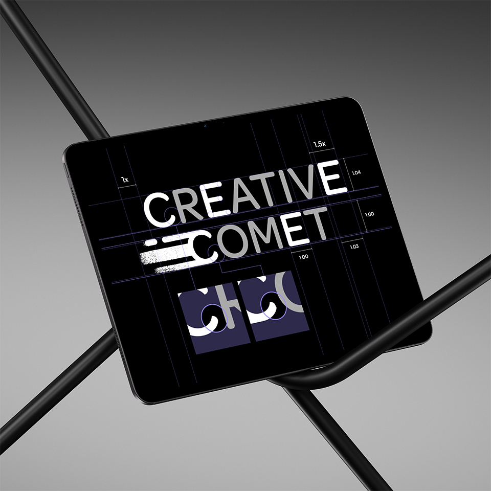
The old comet logo was visually appealing but conceptually narrow. It spoke only to speed, not to the integration and adaptability that made Creative Comet different. We redesigned the logo as part of a full brand identity system, building it from four key elements:
These forms were inspired by the five most common video ratios — 21:9, 16:9, 4:5, 4:3, and 1:1. Reorganized into a balanced square grid and softened with rounded corners, while turning the one of the shapes into a On/Off switch.
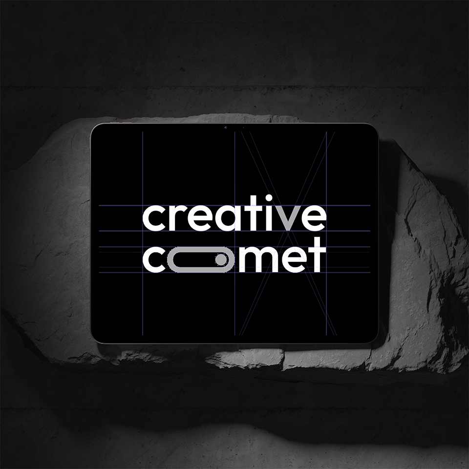
The new brandmark became a modern, flexible symbol of Creative Comet’s embedded role.
The new identity matched how clients already saw Creative Comet — embedded, flexible, and essential. The work turned insight into a usable system built for growth.
Most importantly, the rebrand reinforced their unique model: Content as a Service (CaaS). By naming and framing their approach, Creative Comet could articulate their difference with clarity. The new identity not only supports growth but also amplifies the value of CaaS — a model built on simplicity, integration, and scalability.
